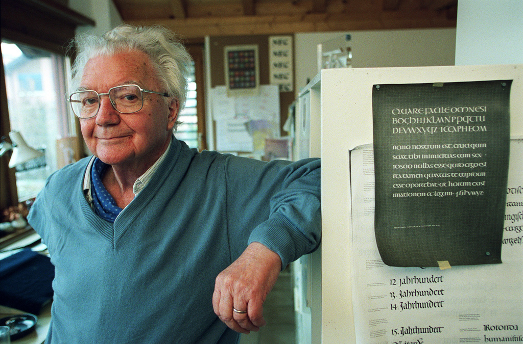
Adrian Frutiger, forever true to type
Adrian Frutiger, who died in 2015, was one of the most influential Swiss typographers of the 20th century. His work, exemplified by the Univers typeface, was a precursor for the way typography is approached today.
Without necessarily realising it, we have all had Adrian Frutiger's creations before our eyes on numerous occasions. Frutiger, who died in September 2015, aged 87, was the creator of the eponymous typeface – used on Swiss road signs and passports – and many others that we see every day without even noticing them. But the influence of this Bernese artist, who devoted his life to typeface design, extended far beyond the borders of his native country, as his work marked a turning point in design and technology. "With his work, Adrian Frutiger set a new standard for information-led typography," says Swiss graphic designer François Rappo.

Born near Interlaken in 1928, Frutiger was attracted to drawing and sculpture from an early age. He completed an apprenticeship as a typesetter and then continued his studies at Zurich University of the Arts, the breeding ground for a generation of typographers who would go on to make Switzerland famous, including the creators of the emblematic Helvetica typeface. As a student, he displayed great passion for the history of his discipline: as part of his final diploma work he produced a set of engraved wooden plates retracing the history of European typography since Ancient Greece. He always considered himself first and foremost a craftsman: "For me, the work of a typographer is just like sculpting," he explained in 1994 in an interview with the Neue Zürcher Zeitung. "I'm the brickmaker, not the architect. I just make good bricks for graphic designers to build with."
Creator of the Univers typeface
Diploma in hand, he was hired at an old established Parisian foundry, Deberny & Peignot, where he quickly set about developing a new, revolutionary technique based on a photographic principle – photocomposition – which would subsequently spell the end of cast lead type. Frutiger was one of the first typographers to fully embrace this new technology, which enabled him to design a wide variety of typefaces and to think about his first major project. His ambition "to achieve the best possible legibility" was matched by his undeniable technical gift, and this combination led him to design Univers in 1957. He based it on the late 19th century typeface Akzidenz-Grotesk and on sketches he had made during his studies in Zurich.
Up until that point, a typeface would be designed in just one or two weights, and then eventually expanded to include other formats, sometimes by different typographers. But Frutiger came at it from a different angle, creating from the outset a whole family of coherent typefaces, made up of 21 series (italic, bold, condensed, etc.) designated by numbers and designed with harmony in mind. Univers marked a turning point that paved the way to digital typesetting. "It heralded the systematic way in which we view typography today," says François Rappo.
To promote its new creation, Deberny & Peignot presented the family of characters in a chart reminiscent of the periodic table. Univers became an instant worldwide success – it was adopted in particular by IBM typewriters – and Adrian Frutiger began to make a name for himself. He founded his own studio and from the early 1970s his work could be found all over Paris: he redesigned the characters used in the Paris métro and developed a special typeface for Charles de Gaulle Airport. This typeface developed for signage was subsequently adapted for text, resulting in Frutiger, which is judged by many to be his most accomplished work. It is now used just about everywhere: on Swiss roads, for the numbers on euro banknotes, in a condensed version on Swiss passports, and even in the WHO logo.
OCR-B, the universal standard
But another creation of Frutiger's is even more widespread and has become a veritable universal standard: he developed OCR-B back in 1963 at the request of the European Computer Manufacturers' Association (Ecma). Ecma, which was the standardising body for the emerging field of information technology, required a typeface which was machine-readable – OCR stands for Optical Character Recognition – but which was also adapted to the human eye. The constraints were considerable, as all lines had to have the same width, and letters and numbers had to be different enough not to be confused by an optical reader. OCR-B was completed in 1968, and since 1973 has been the worldwide standard for barcodes, ISBN numbers and inpayment slips, and is also used on the back of Swiss identity cards.
In 1994, having now returned to live in Switzerland, Adrian Frutiger said "Every typeface is a child of its time. But there are some that transcend the centuries and remain an integral part of our culture." There is no doubt that for the 20th century, some of his creations are of that timeless variety.

Original article by Florian Fischbacher, published in Le Temps in July 2020


